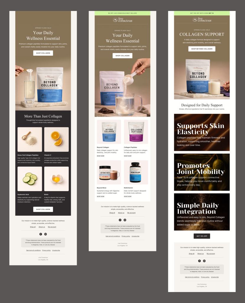
The final iteration focused on optimizing content hierarchy and persuasive flow. Benefit-driven sections were restructured to highlight key value propositions such as elasticity, joint mobility, and daily integration. Strategic contrast blocks were introduced to break monotony and guide user attention toward primary CTAs. Visual rhythm and spacing were fine-tuned to maintain engagement from top to bottom.
Outcome: Increased clarity in messaging, stronger product storytelling, and improved engagement potential through clearer CTA emphasis and benefit framing.
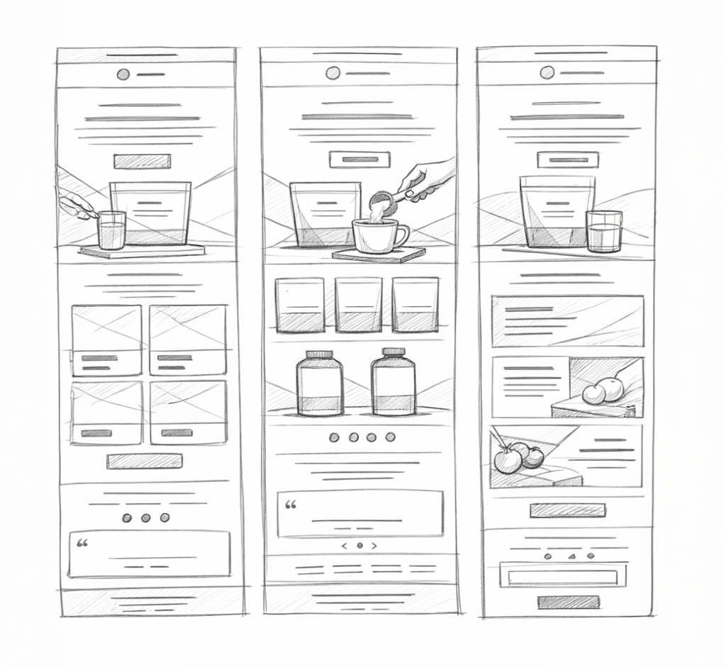
I began by sketching layout variations to explore hierarchy, product emphasis, and content pacing before moving into high-fidelity design. The goal was to create a clear visual flow that balanced educational messaging with conversion-focused promotion.
Outcome: Established a strong structural foundation that improved clarity and guided readers naturally toward primary CTAs.
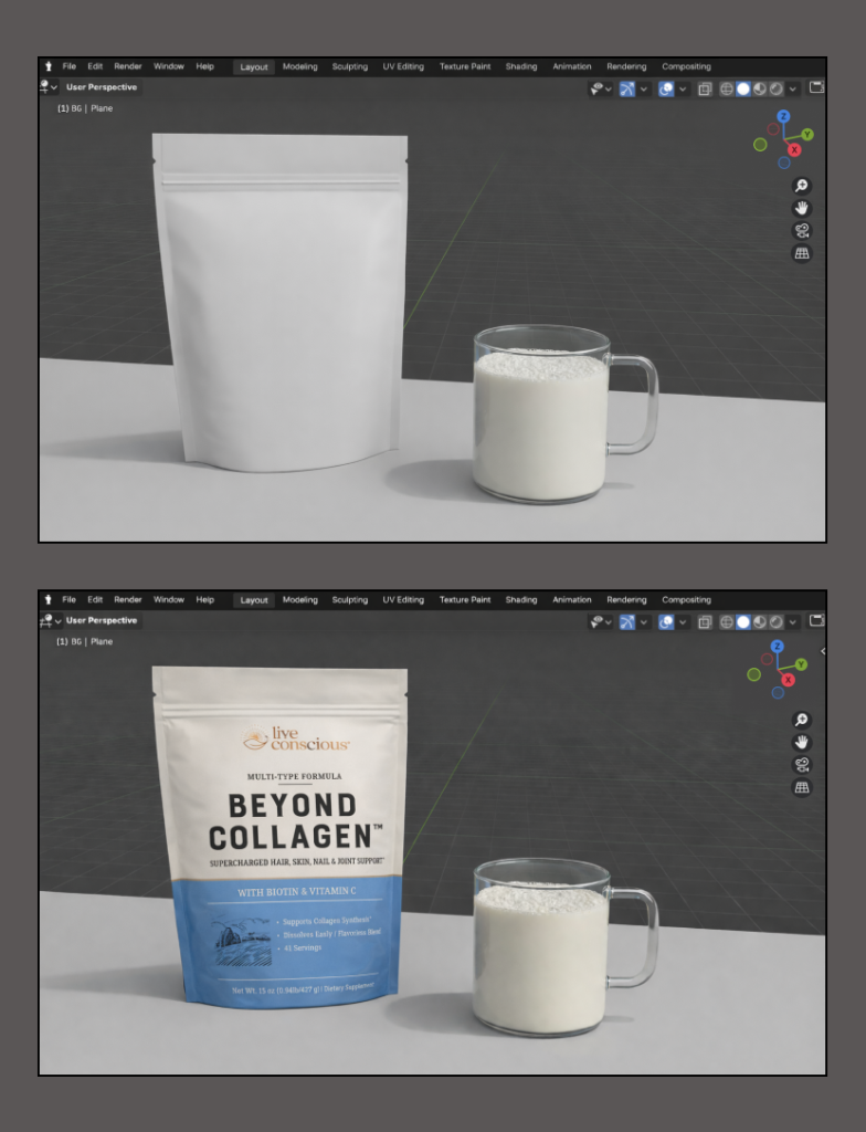
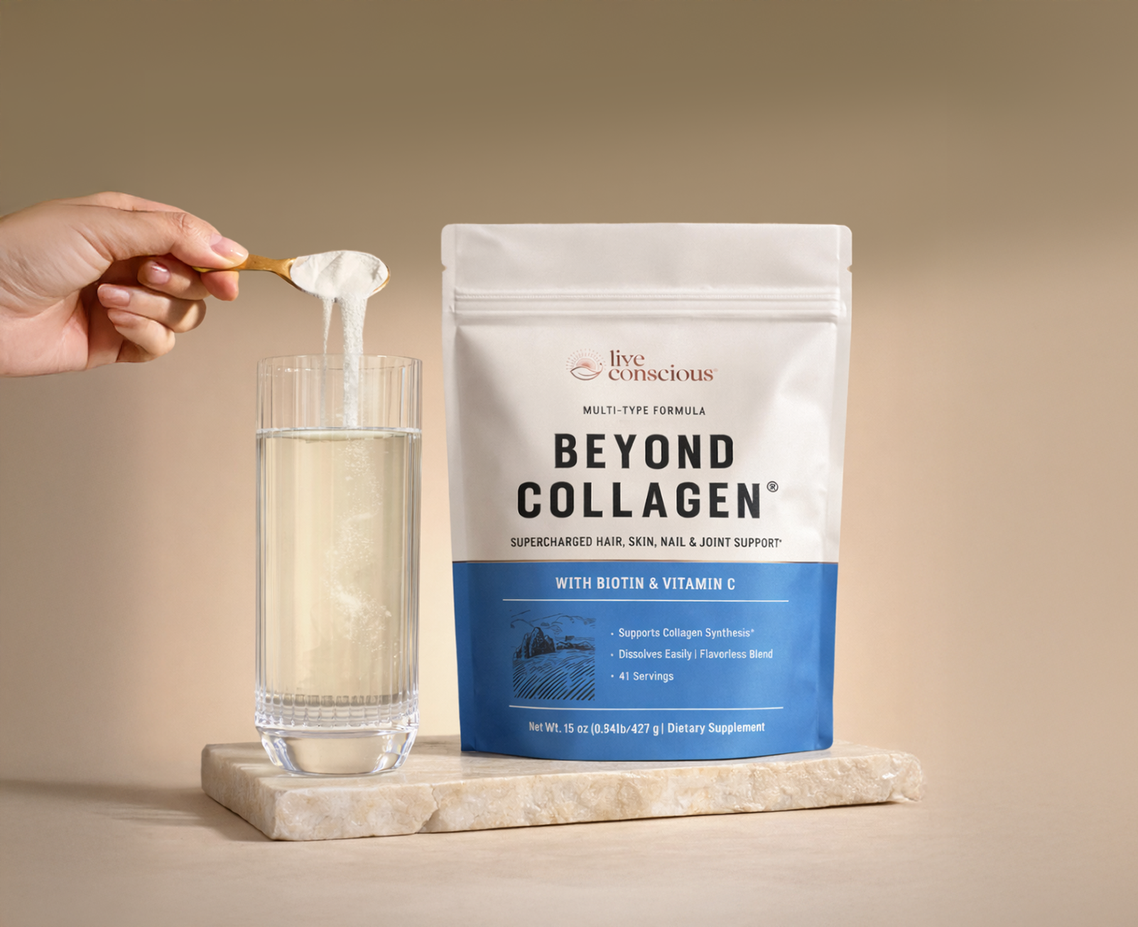
I used Blender to create refined product renders with controlled lighting and material accuracy to enhance perceived quality. This helped reinforce product credibility and create a more premium visual presentation within the campaign.
Outcome: Established a more structured, conversion-focused foundation that improved readability and set the direction for scalable email templates.
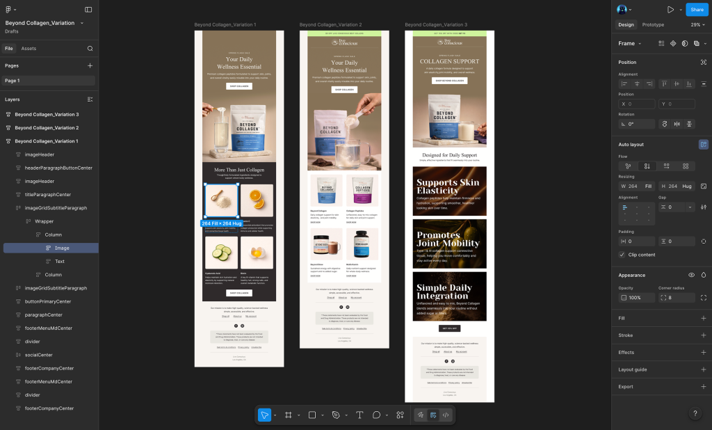
Figma was used to build scalable components and structured layouts that ensured consistency across campaigns. Its modular system enabled rapid iteration, efficient collaboration, and easier performance-driven updates.