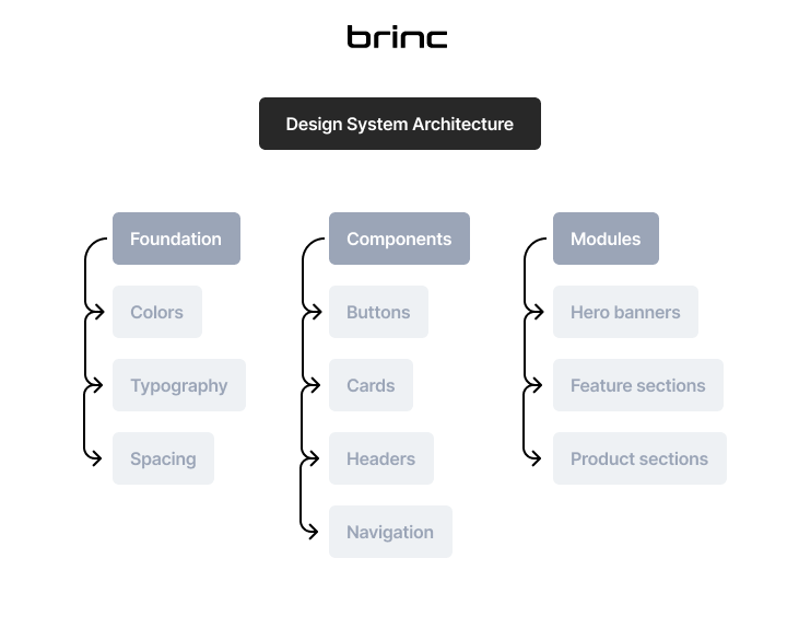
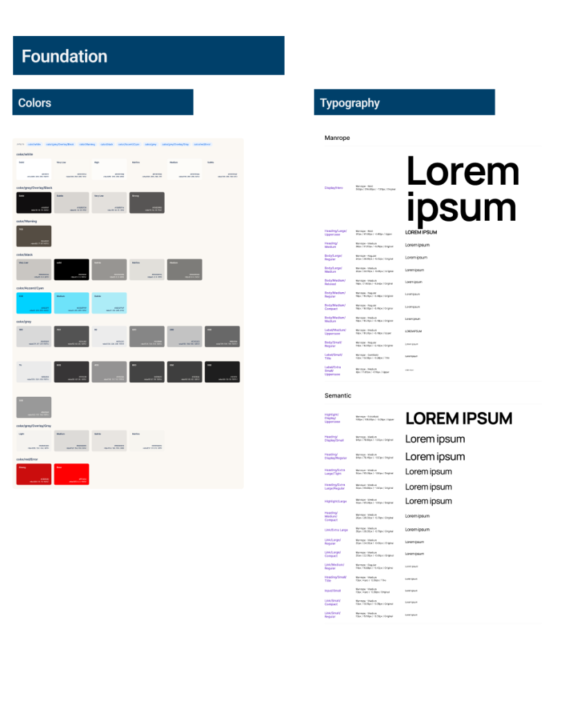
To improve consistency and scalability across the BRINC website, I developed a modular design system used for marketing pages, product pages, and landing experiences.
The system standardized typography, color usage, UI components, and modular content sections, enabling the team to rapidly build pages while maintaining brand consistency.
Outcome:
The design system improved efficiency and consistency across the BRINC website.
By establishing reusable components and modular layouts, the team was able to build pages faster while maintaining a cohesive visual experience.
Tool: Figma
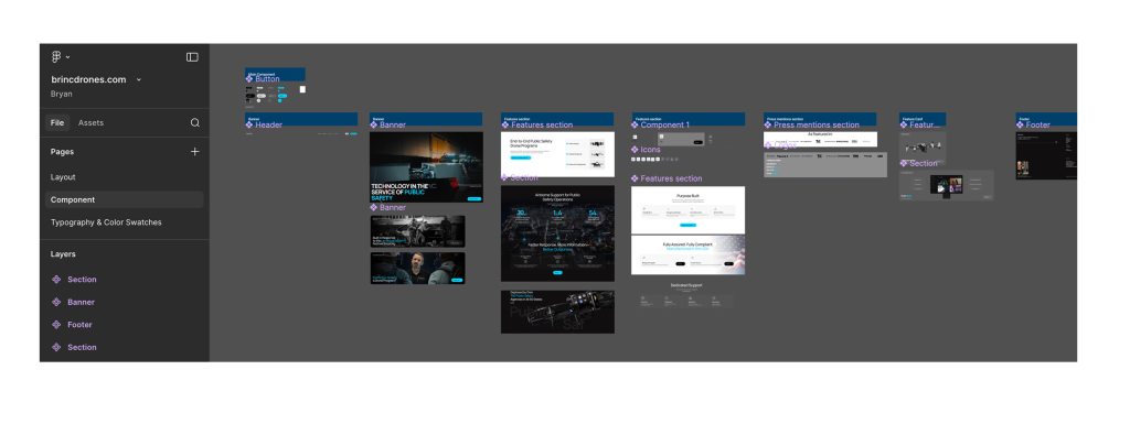
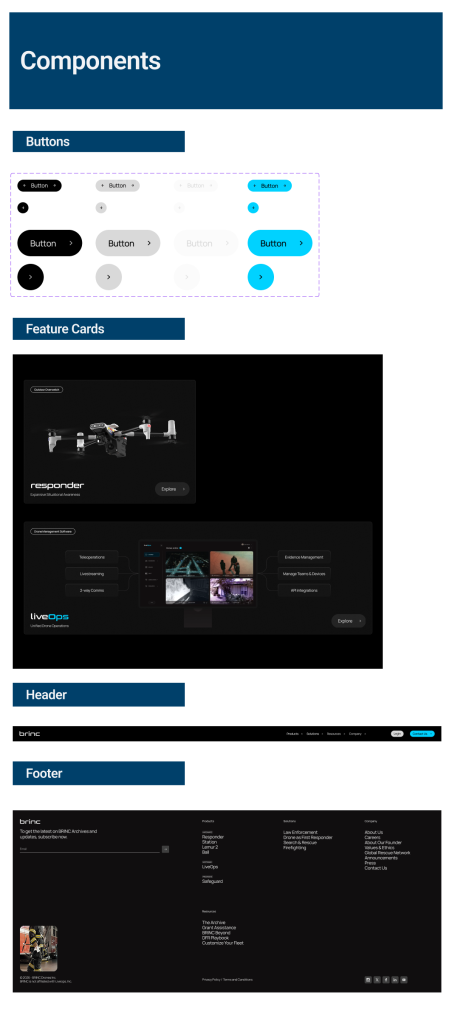
The design system was organized in Figma using structured component libraries and modular layouts.
Designers could quickly assemble new pages by combining modules and components, significantly reducing production time and maintaining brand consistency across the site.
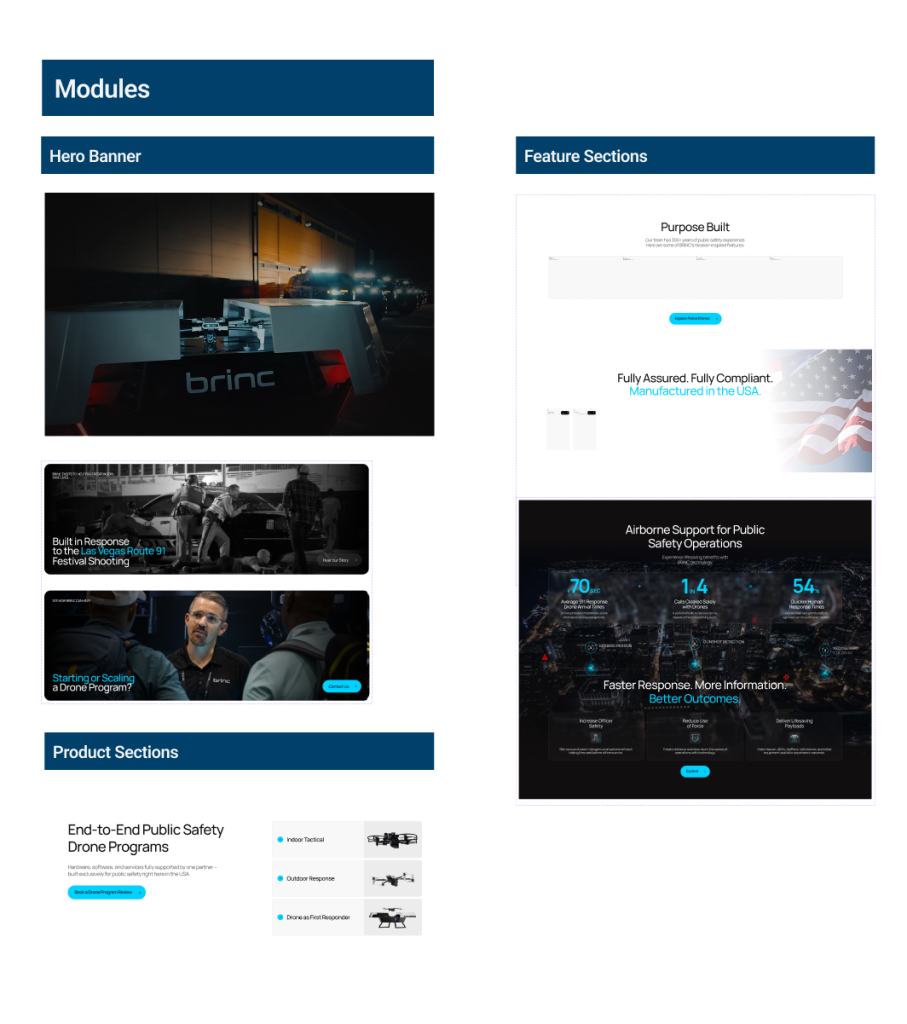
Modules combine multiple components into complete page sections used throughout the website.These sections enable rapid page construction while maintaining clear layout structure and visual hierarchy.